

Redesigning a website for clarity of information
How I helped to rebrand ICMART’s website to increase findability of medical articles
A note from future Evee
Hi, this is Evee from 2023. This is an older project I did as an intern (2019), and interestingly I look back now and recognise design decisions I would have approached differently. Nevertheless, I believe it’s still important to share, as it’s a reminder of how everyone starts somewhere. This was the case study that got me my first design job too !
Delightful illustrations courtesy of Brandon Mendoza (Blush)
Overview
Problem
ICMART’s website (created circa 2009) was intended to be a hub of medical articles for health professionals, academics, and researchers. However, their website was outdated, and information was difficult to find due to “post everything” syndrome.
Solution and my role
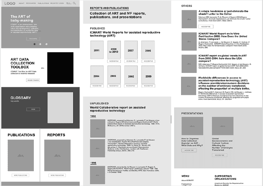
I took things a step further (understatement), did a website audit, rebrand, and prepared some high fidelity prototypes.
Impact
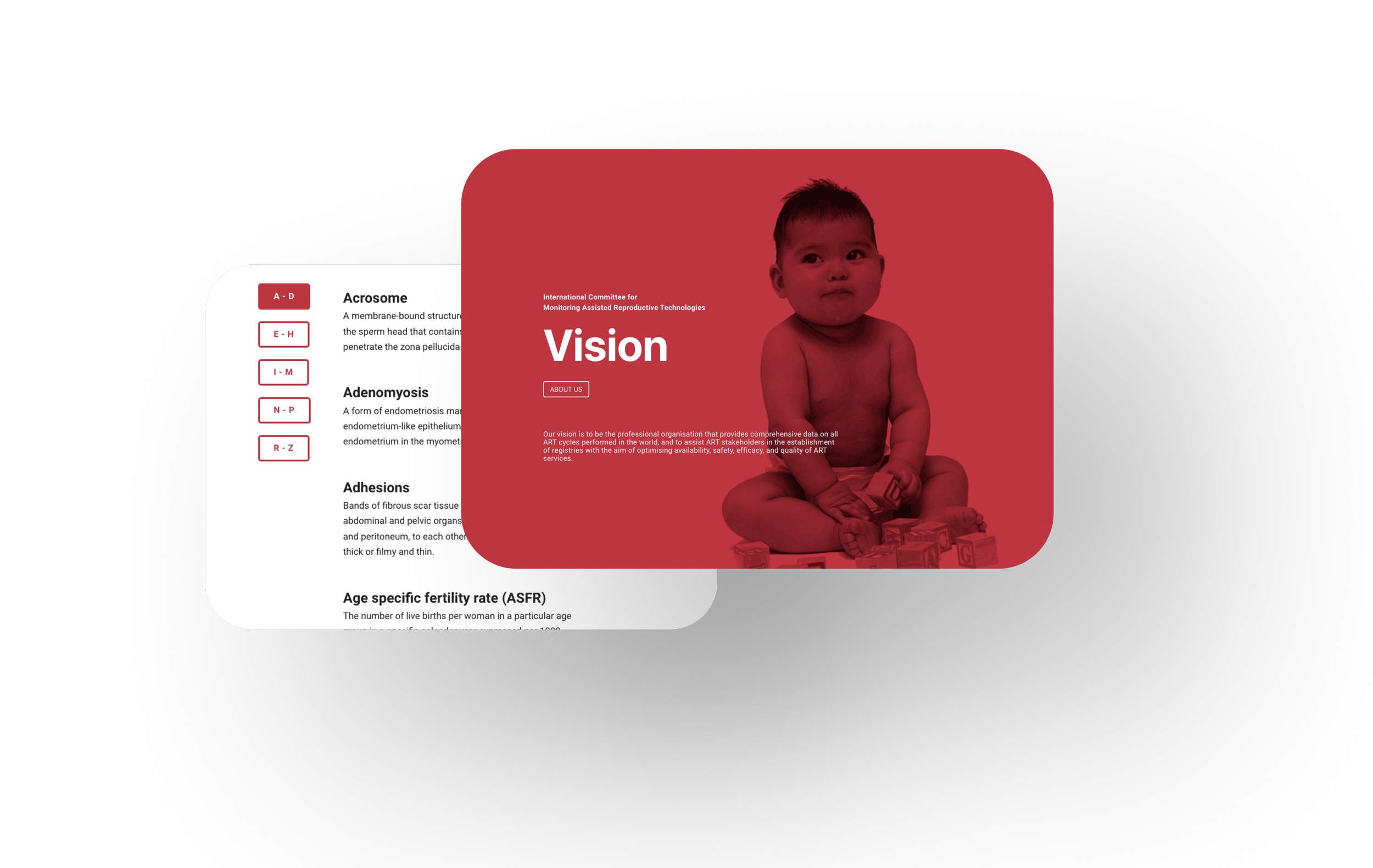
The proposed design has been developed into an official website.
-
Discovery
UX Research
Website audit
UI Design
Prototyping -
Product Owner (Lecturer)
-
Approximately 6 months (2019)
Problem Statement
Health professionals, academics, and researchers constantly deal with high volumes of data, and might miss crucial information and resources if it is not presented in an organised and digestible manner. How might we improve the readability and credibility of ICMART’s website, to make information more accessible and relatable to health professionals ?


Process overview
STEP 1
Empathise
I had an interesting starting point, because this project did not initially have a clear goal, apart from a general desire on the client’s part for an aesthetic redesign.
To further get to the core of the client’s problems, I conducted a user interview and asked some key questions:
What are you mainly trying to communicate through this website?
Who is the intended target audience of the website?
What is your long-term vision for this website?
STEP 2
Website audit
After understanding and conceptualising the client goals, I performed a website audit to get a sense of the problems areas that were currently obstructing these goals, and organised them into 3 distinct categories.
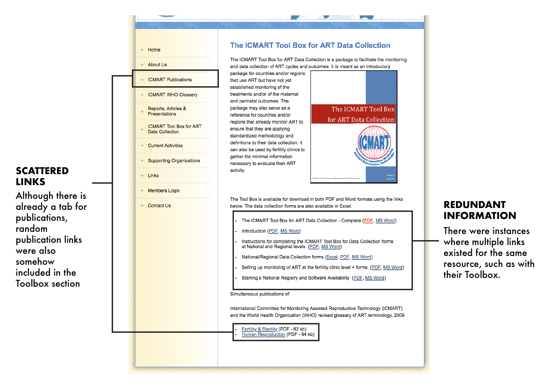


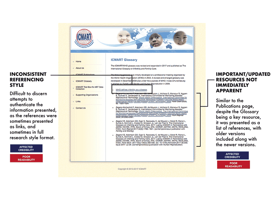


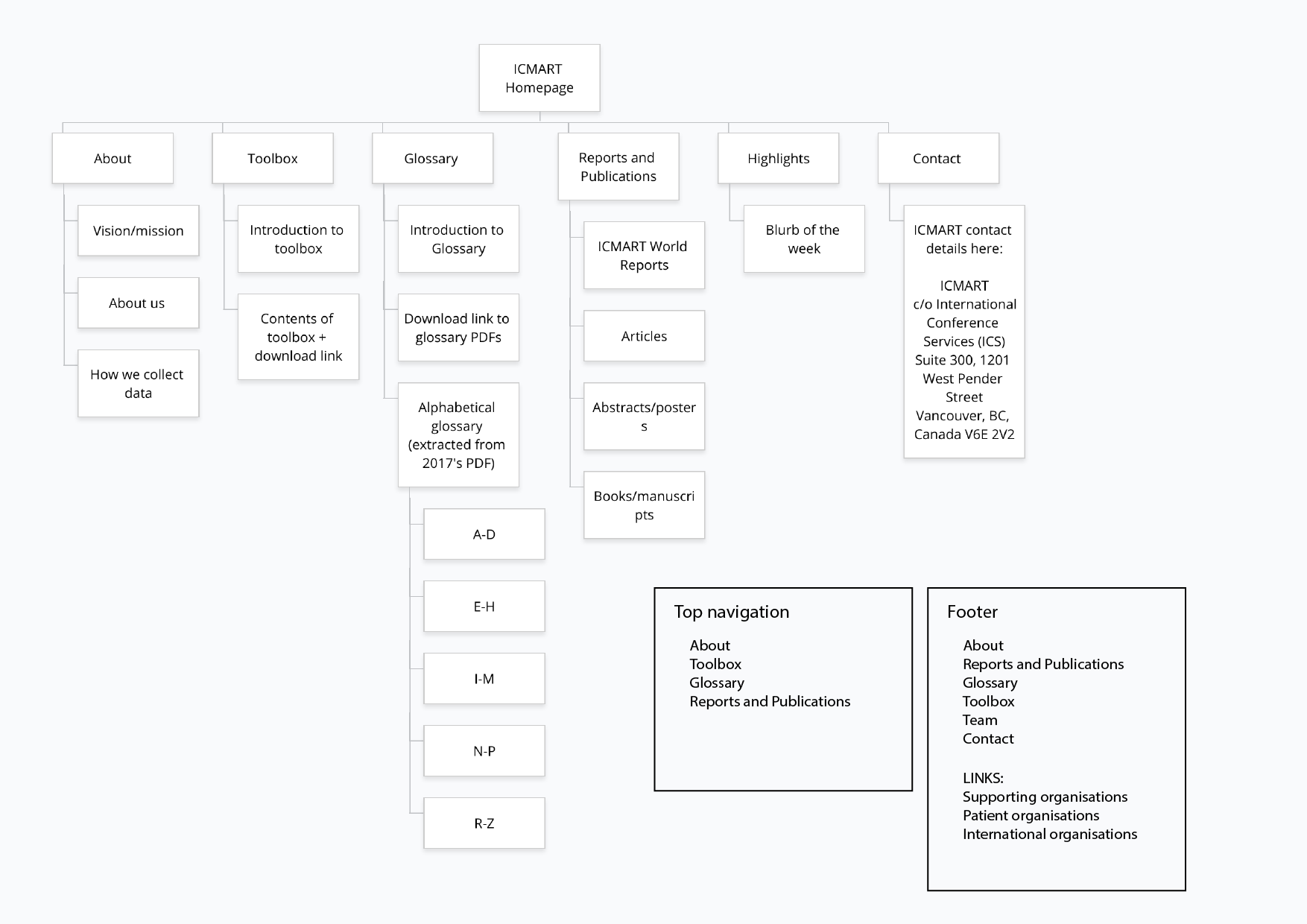
Information Architecture
Iterate, iterate, iterate
Outcome


Reflections
Communicate with visuals
I was working with clients who were largely unfamiliar with design terminology and website trends, just as I was unfamiliar with scientific jargon related to a field I know nothing about. Visual communication was incredibly helpful for me to bridge the gap, and allowed me to present my ideas and thought process in a coherent manner, while preventing misunderstandings.
The client may not always know how to verbalise what they want
“Improving a website” is a pretty broad term, but it was very helpful to interview clients prior to starting the website, because it helped me to clarify the target audience for the website. This drastically changed the direction of the redesign, and influenced the tone, visuals, and colours used. Through trial and error, visually communicating the potential outcomes, and gently questioning why certain things need to be included (“do we need multiple links for the toolbox?”), I could narrow down the client’s needs and wants.
Don't be afraid to experiment, fail, and learn
This was the first time I took on a full-scale website redesign project. Prior to that, I knew little to nothing about website development, UX, UI, or information architecture! I was afraid of messing up, especially because this was the first time I was given a design brief with a real world application. I realised that I was inefficient when I started getting stuck on trying to make sure that I was doing the “right,” thing... by attempting to follow the right website design rules and processes. Ultimately, I was learning the most when I just got my hands dirty, experimented, and got feedback in return.