Designing a smoother medication management experience
Translating research insights to design
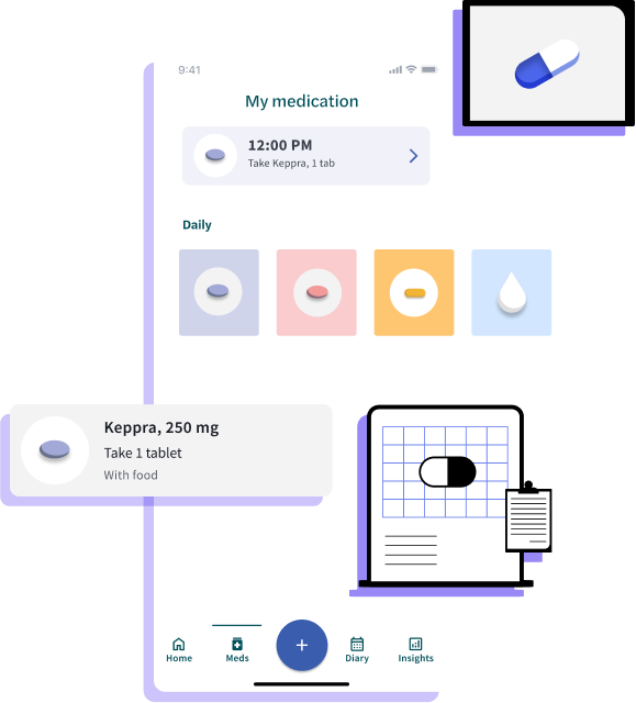
Delightful illustrations courtesy of Brandon Mendoza (Blush)
Following discovery, we got clear on user needs for medication management.
We audited our app and noted some key usability issues with flows, scheduling, and information hierarchy.
Now begins the messy and uncertain process of translating research into tangible designs. Will we succeed ?
(spoiler alert, we do).
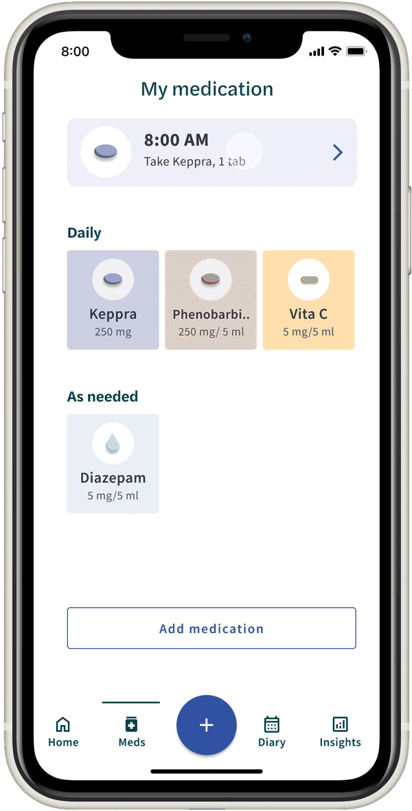
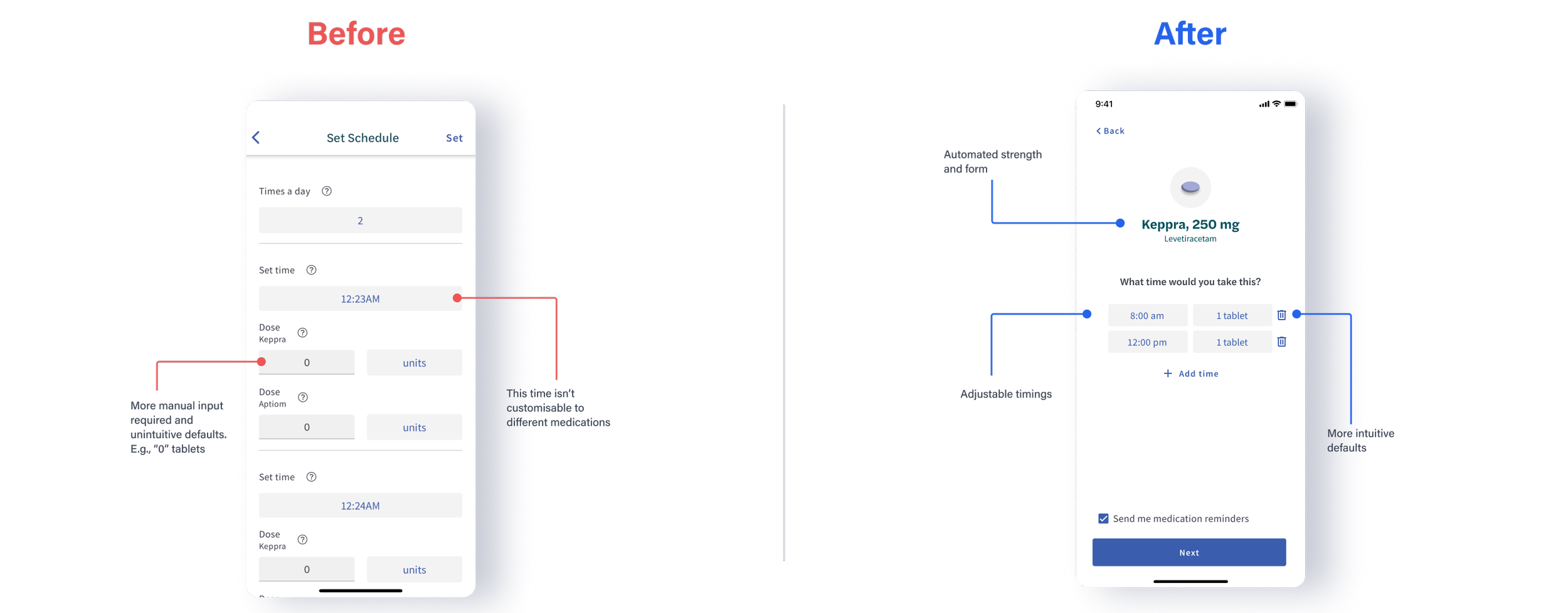
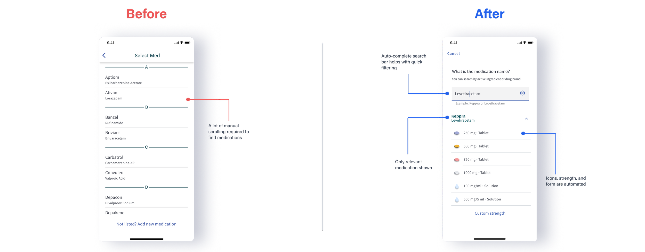
Medication summary page
Scheduling screen tidy
Overview
Problem
Seer app’s current medication manager wasn’t user friendly. Following discovery research to better understand user needs and usability issues, we now needed to translate the insights into designs.
Solution and my role
As the sole designer, I worked end-to-end to deliver user flows, develop the information architecture, wireframes, mockups, and a working prototype. I collaborated with my team and external stakeholders regularly for design feedback and iteration, and supported dev handover.
Impact
The redesign proposal received positive feedback, and is currently being developed for release. This is an ongoing project.
-
User flows
Information Architecture
Wireframes
Usability testing
Prototyping -
Product Manager
Data Scientiest
Senior Developers
-
2-3 months (approx)
Design Goals
More intuitive flows
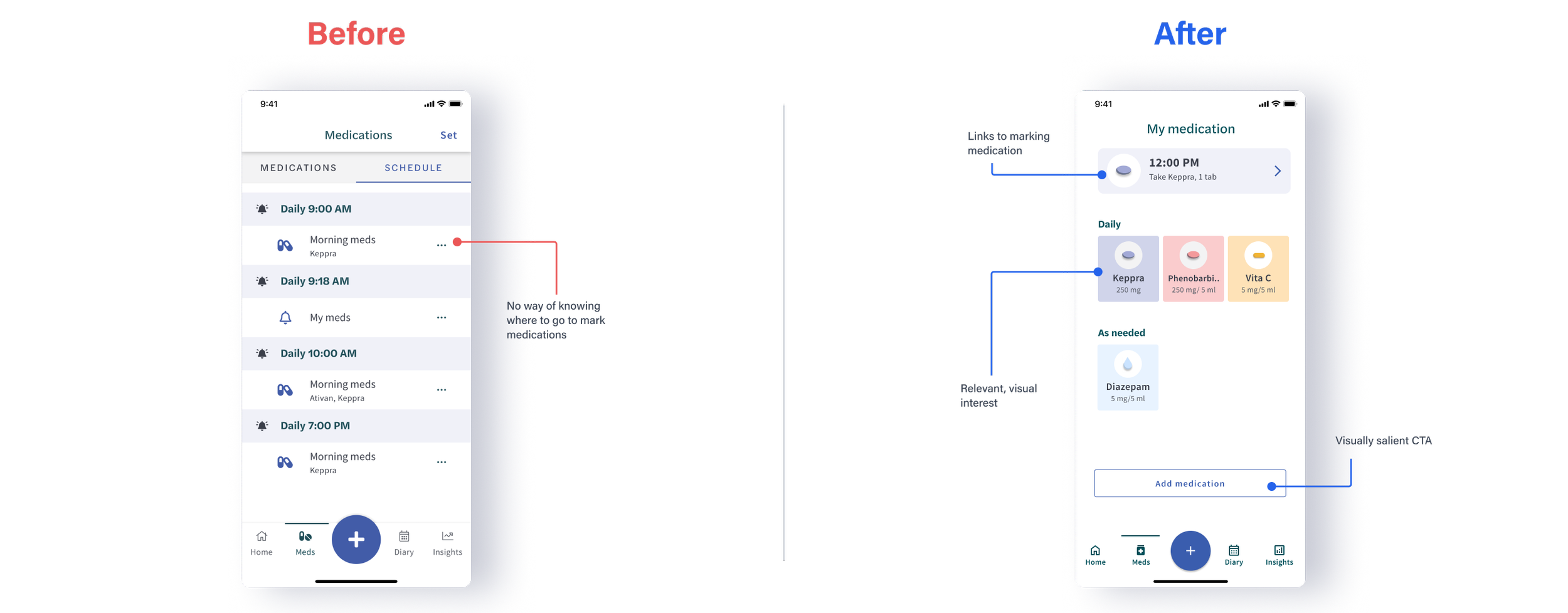
Noting that users need support in tracking time, dosage, frequency and adherence records, the interface had to guide users step by step from scheduling to marking medications.
Simplify interface
Bearing in mind that experimentation is expected before patients find the right medications, the interface had to be simplified, but also be able to support a lot of features that support scheduling flexibility and edits.
Design Challenges… and some things I tried
Feature prioritisation
We had a lot of ideas that were sparked from discovery, but limited time and resources
IA and User Flows
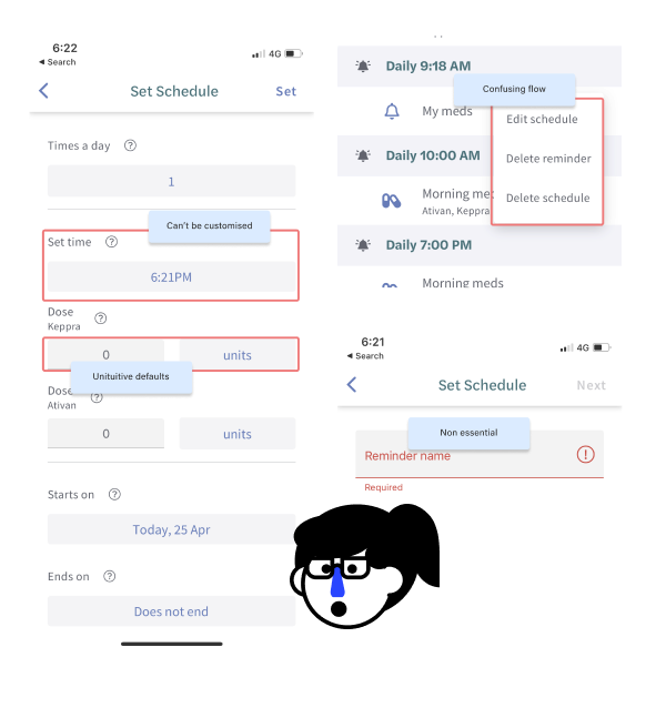
The current medication manager was disjointed, and had confusing flows where it wasn’t clear where it started and ended
Rapid prototyping
We had multiple interfaces that were suffering from feature cram, and multiple possible approaches... but we could only pick one!
1 of 3
Feature prioritisation
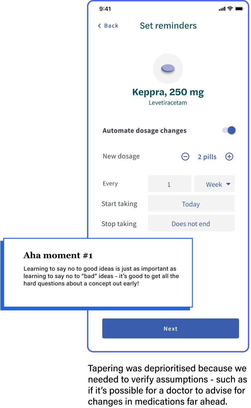
From quick concepts and discussions with the team, we identified some limitations early on, and prioritised foundational features using insights from competitive analysis.
Phase 1 (prioritised)
Scheduling
Marking
Editing
Phase 2 (future)
Tapering dosage
Refill reminders
Side effects logging
2 of 3
IA and User Flows
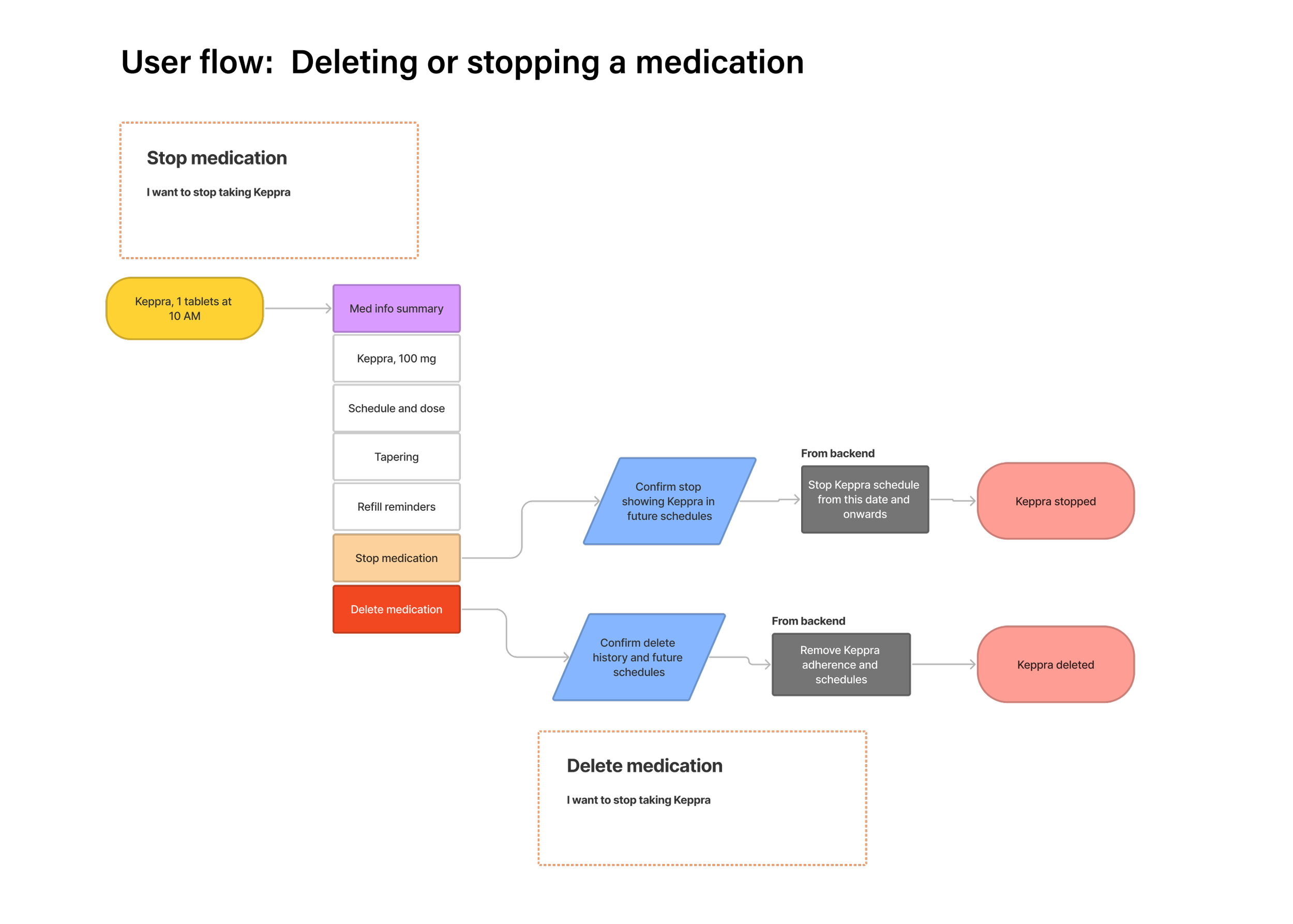
I used Information Architecture to help me identify dead-ends in the flow. I then used User Flows to make sense of how features should be sequenced, especially for complicated actions such as editing.


Some of our current interfaces suffered particularly from feature cram. I did rapid prototyping of a few different approaches, and discussed them with my team for feedback.
3 of 3
Rapid prototyping


Testing with stakeholders
There was this one detail in our adherence options I was very unsure about … the fact that we had both skipped and missed (why?!) After ruminating on it for a bit, I told my Product Manager, Wil how I felt.
I remember Wil saying... “Well, why don’t we ask Mark?” (our in house neurologist). We showed him the design and he confirmed that there was no clinical value in differentiating between skipped and missed, which validated my assumptions instantly.
He also liked the new design !

Reflections
As a resource-stretched team, we have to constantly balance future vision with pragmatism. I found myself letting go of a lot of ideas or designing to scope. Despite that, I found that planting seeds for future aspirational designs, even if it wasn’t implemented now, is an equally important part of the design process.
You can’t have it all, and that’s okay
Trust my own design instincts
To meet sprint deadlines, there were some designs decisions I executed despite my gut feeling strange, but found myself questioning them later on in the process. I later found out that other people shared my view, which made me wish I spoke up earlier. This taught me a valuable lesson on trusting my own gut feeling with designs… if it’s feeling strange, there’s a reason for it!
Also that sometimes, the solution is simpler than it seems, if I just ask.
Impact and next steps
This was my final project before I transitioned into a Design Ops role, before handing the design process over to the new designer. It’s been bittersweet.
The story does not end here. Much more testing and iteration still needs to happen before its “final” form. Given an opportunity, I would love to measure if progress was made via metrics, such as adoption rate, engagement, or TTC (time to completion) for scheduling.
Although I was sad to not be able to see it through, I’m proud to kickstart the process of improving a feature that will impact thousands of users, once it’s released. Regardless, I will take my time to celebrate getting this far.